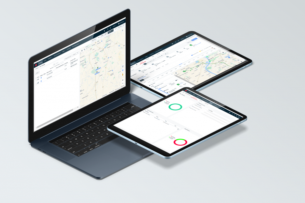
A brand new interface is here with all of the familiar functionality! The platform like you already know it, but optimized to help you work more concentrated and efficiently. This new design is inspired by our clients together with modern UX concepts.
What are the changes?
The biggest change is the color theme, fonts, lines, icons and other visual components. The menu structure, buttons, page lay-out and forms will stay the same as before.
Hover over the image to see the before and after.
Why did we do it?
Innovation and modernizing are important for us at Suivo. Our webplatform gets updated 4 times a year with improved functions and features. Now we came at a point that improving the looks of the software would actually improve the functionality for our users. The main goal was to make it feel lighter, more modern and calm to enhance the user experience. This helps to focus better on the task at hand without any unnecessary distractions.
“Our goal with the new look & feel is mainly to create a more calm and modern work environment. We want to help our users focus better on the content of their jobs.” – Nane Boudewijns, UX Designer at Suivo
Inspired by our users
To get to the results we have today, we collected feedback from our clients. A group of users tested the new interface during a couple of weeks. With their feedback we were able to perfect any visual components. If you have any feedback or feature requests, you can always contact us to let us know!
Hover over the image to see the after and before.
Release note
You can find the full release note on our servicedesk page;
